|
|
| Home |
|
Documentation Screenshots Download/Sources Links Roadmap Bugs & Wishes

|
 |
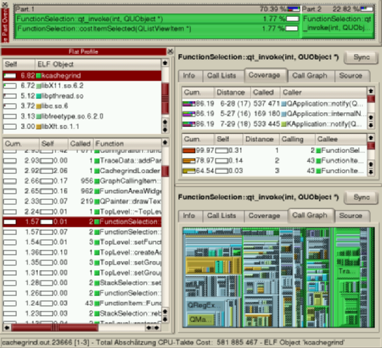
Screenshot 2Coverage lists and call tree graph visualisation.
First note the "Trace Part Overview" stretched over the whole top window width: This enables drawing of names and costs. The "Flat Profile" here shows two lists, as function grouping is switched on, here by "ELF objects". The upper list shows all involved ELF objects in the profile run: this is your executable, all used shared libraries, and perhaps even plugins. The lower list now only shows the function in the selected group 'kcachegrind' (the executable). The main window is split up into 2 panels, one showing the Coverage of function 'TraceData::TraceData', the other a proportional call graph of "main". The Coverage Tab shows 2 lists: the upper with all functions calling the selected one: even functions are listed that only indirectly call 'TraceData::TraceData', i.e. __libc_start_main with Distance 2, using the function "main" inbetween. The lower list of the Coverage tab shows all called functions. E.g. see the last line with distance '6-13 (7)' and call count 281084. These calls happened always way below the stack frame of 'TraceData::TraceData'. More exactly, there always were at least 5 functions inbetween on the stack. The number in parenthesis is the median, i.e. the distance where most cost was spent. The bar graph in the left in fact shows the partitioning of calls according to the call distances. When a grouping mode is switched on, each group now gets its own color; functions inside a group have the same color. Thus, the colors of the call graph show a quick overview of in which ELF object time is spent. The call tree graph is a TreeMap. This shows recursive structures as nested rectangles, where the area of the rectangles is proportional to the cost spent in the function the rectangle represents. You can switch between true proportional mode and 'almost' proportional mode, where one can see the nesting structure. In the screenshot, this is not possible, but now big rectangles really represent functions with high costs. By clicking the mouse into one rectangle, you would select the corresponding function for the upper panel.
|